

SoraRabbit Short Hop 030: That Time SoraRabbit Read More Liefeld Comics Part 3
And I’m back already with more Rob Liefeld roasting! If you recall, this series was designed to help me get through the difficult task of reading the drawn and plotted Rob Liefeld X titles from the 90s. I have to get through them somehow if I’m going to complete my quest to read every X-related comic Marvel has ever put out. And writing these posts is my outlet because, as I’ve established, I’m a hater. But specifically of Rob Liefeld’s art and plots. I love X-Men but cannot stand Liefeld. You see my dilemma. Anyway, here are the other chapters in this voyage of ours:
SoraRabbit Short Hop 011: That Time SoraRabbit Read More X-Comics
SoraRabbit Short Hop 024: That Time SoraRabbit Read More Liefeld Comics Part 1
SoraRabbit Short Hop 028: That Time SoraRabbit Read More Liefeld Comics Part 2
And with this chapter, we’re finally here, the destination we’ve been working towards… X-Force.
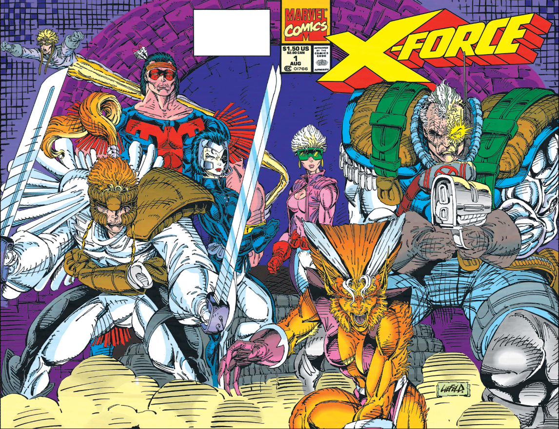
Glorious, ain’t it? (Credit: Marvel Comics)
Taken From: X-Force #1, cover date August 1991. Writer: Fabian Nicieza. Art and Plot: Rob Liefeld.
Context: The time has finally arrived, this is a Force to be reckoned with… a Force for… X?
Thoughts: Wow. I included the entire wrap-around cover for Issue 1 because it’s… well, it’s something. That’s about all I can say. It’s a standard group shot of the team. All bulging muscles, fierce looks, and the most boring and generic background you can get without it just being a solid color. Art-wise, the composition of this cover is dreadful. There’s no pattern for the eye to follow, no pleasing grouping. It’s just all the characters in varying sizes and widths, strewn about two glossy pages. It would make more sense to have Cable and Boom-Boom swapped so that there’s some sort of balance but I don’t know that this can really be saved.
Cable’s face has so many lines, but his metal arm is on the correct side this time. It’s weird that his metal arm has bulging muscles, though. Are those built in or can he flex metal? His left hand is holding the gun, I’m not sure what his right hand is doing. It just sort of trails off, hiding behind the gun. It’s not a two-handed gun either. That would make more sense. Everyone is so ugly. I know they’re supposed to look imposing and intimidating, but nothing is really happening. And Boom-Boom is just sort of awkwardly standing there looking lost.

SHAKK. (Credit: Marvel Comics)
Taken From: X-Force #1, cover date August 1991. Writer: Fabian Nicieza. Art and Plot: Rob Liefeld.
Context: Honestly I don’t even remember this guy’s name. Reaper or some shit? Probably. There were a lot of forgettable villains in the first issue.
Thoughts: Now we know the sound of a hand leaving the body: “SHAKK“ with two K’s. Shatterstar’s swords change length from panel to panel. And don’t tell me that’s forced perspective and it’s pointing away from us. In some panels his blades seem almost as long as his body. Also, since he’s a sword guy, what exactly does he keep in those pouches? Can’t be ammo. Energy drinks? Steroids? Hmm… Now I’m gonna be wondering about the pouches.

They go to the same stylist. (Credit: Marvel Comics)
Taken From: X-Force #1, cover date August 1991. Writer: Fabian Nicieza. Art and Plot: Rob Liefeld.
Context: Two triangle-haired beasty-peoples fightin’. Fightin’s awesome.
Thoughts: At the risk of repeating myself, Feral’s tail is ridiculously long and thin. I don’t know why they both have to have upside-down triangle hair. I seriously had to look this dude’s name up because he’s so forgettable. His name is Wildside. (Not to be mistaken with Wildchild, who’s a totally different feral claw guy.) What’s the point of him wearing armor only on his shoulders, shins, and wrists? The rest of his costume is clearly thin and form-fitting. Oh, right, the 90s. The 90s is the point. That also explains the open chest tunic with huge shoulder pads and loin cloth with no pants that Feral is rocking. I do feel bad that she doesn’t get any pouches though. Poor kitty girl. If she had pouches she could store catnip and salmon-flavored kitty treats. No wonder she’s so mad all the time.
And no, I did not capture that tiny word bubble at the bottom on purpose, but I left it because it fits.
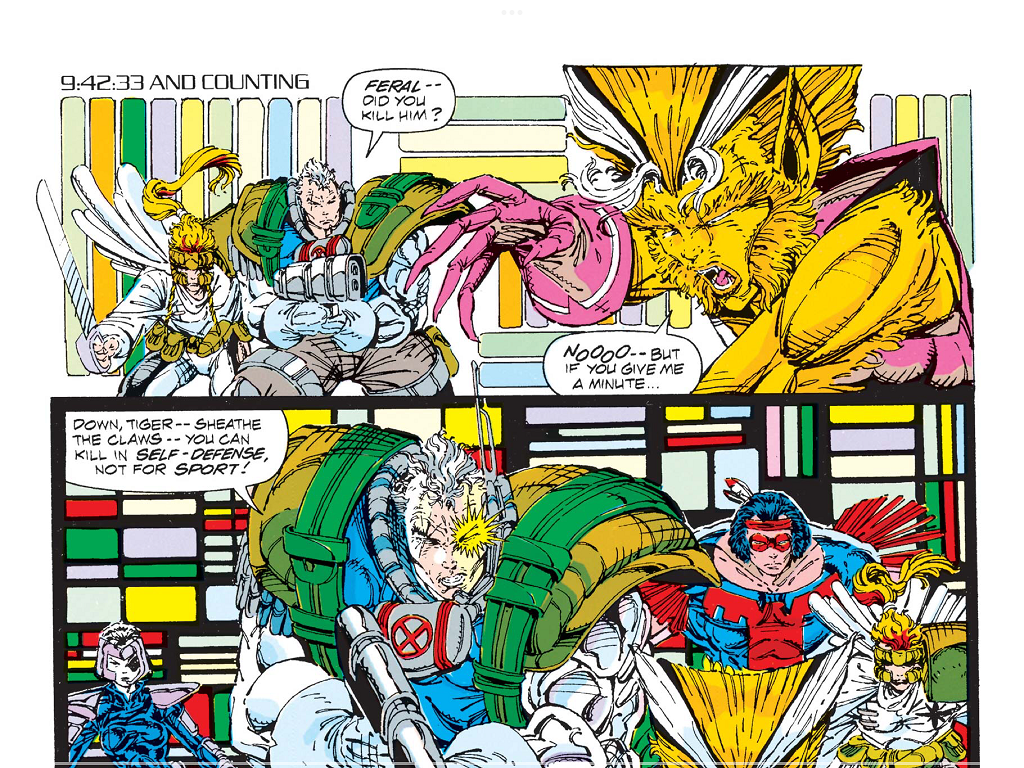
Feral mauls a generic enemy. (Credit: Marvel Comics)
Taken From: X-Force #1, cover date August 1991. Writer: Fabian Nicieza. Art and Plot: Rob Liefeld.
Context: Cable reminds Feral of the proper time to kill.
Thoughts: No one can pull off huge-ass 90s shoulder pads like Cable. Why is he pointing his gun right at Feral as he’s questioning her? I guess that’s probably the best way to reprimand her for mauling a guy so unimportant he didn’t even get a name. Notice how each of her fingers is longer than the last. Plot-wise, I’m very confused about Cable being anti-killing when he spent several issues telling everyone they’re fighting a war and would have to do whatever it takes to survive. Maybe he’s just mad when they kill without being told to kill?

Meet Thumbelina. (Credit: Marvel Comics)
Taken From: X-Force #1, cover date August 1991. Writer: Fabian Nicieza. Art and Plot: Rob Liefeld.
Context: I think her mutant power is looking fantastic is that suit!
Thoughts: You know what? No notes. Good work, Rob.

What would you even call this body type? Potato? (Credit: Marvel Comics)
Taken From: X-Force #1, cover date August 1991. Writer: Fabian Nicieza. Art and Plot: Rob Liefeld.
Context: This guy’s full name is “George Washington Bridge” and no, that’s not a code name. That’s his actual birth name.
Thoughts: G.W. has the most inexplicable posture I have ever seen. I mean, seriously, look at the whole picture. Just take it in. There’s so much about this to unpack. For one thing, his forearms are the same size as his biceps and yet still too short. His proportions are all over the place. His chest is weirdly sunken and less buff than the rest of him, but his ribcage juts out. He’s got some serious butthole-crotch going on. He appears to be pushing his crotch out and his lower legs are at unnatural angles. Check out those… feet? Are those feet? Yeah, I think so. As mentioned earlier, piecemeal armor was the style of the time, so Bridge has only shoulder plates and metal knee pads. (Hmm… No, no, I will not sink to that level of joke. I’ll let you do it in your own minds. Feel free to comment your favorite metal knee pad jokes below this post.) Rob’s extreme love of unexplained pouches is on full display here. He didn’t have enough room around his ample waist so he had to strap more pouches to his thigh. How uncomfortable would that be to wear thigh-pouches everywhere? Especially if they’re full of ammo or explosives or whatever. Gum? Hard candy? Ohh, condoms. Always be prepared. What’s the purpose of the strap around his left arm? Is it a holster? Does he have a pistol or something nestled in his armpit? And finally, what the hell is that paddy thing around his neck? What function could that possibly serve? He looks like he’s wearing a neck floaty.
I can’t decide if I hate or love this panel. No, love is waaaay too strong a word, but it’s fantastic in its own way. Am I getting Stockholm Syndrome? I think I might be.

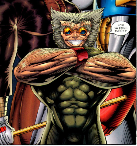
Deadpool really didn’t have a personality yet. (Credit: Marvel Comics)
Taken From: X-Force #2, cover date September 1991. Writer: Fabian Nicieza. Art and Plot: Rob Liefeld.
Context: Hey, look kids, Deadpool’s back!
Thoughts: Deadpool has perfected the patented “Cable Kick”. He’s got his handy pouches and what looks like extra ammo around his arm. I can only assume the bigger pouches are for chimichangas. Look at those adorable ankle warmers! But check how his foot is pointed. Never mind the fact that it appears to be the wrong foot on the wrong leg— feet are tough— but did he kick the dude with the point of his foot? I mean, it looks like it, but maybe he did a ballet pointy-toe move after cracking him in the face with a manly man-kick? Style is everything, but I dunno. I do know that it looks far too graceful to be captioned with a “KRAK“ sound effect. I would think “CHOK” or “SMEK“ would be more fitting.

Team building exercises. (Credit: Marvel Comics)
Taken From: X-Force #2, cover date September 1991. Writer: Fabian Nicieza. Art and Plot: Rob Liefeld.
Context: Yeah, don’t bother reading all that text. All you need to know is it’s a training exercise about to go horribly wrong.
Thoughts: I think Liefeld left Cannonball on the team to avoid drawing two more feet. There is zero reason for him to be blasting right now. The training exercise hasn’t even started. They’re all just standing around talking but Sam has to go flying off in the middle of a sentence. How can Cable even hear what he’s saying? Check out Domino’s blouse. Not really appropriate for training, I would think. But you know… bewbs. Look at how awkward Boom-Boom looks. She’s obviously crouching just so Liefeld could fit her into the panel… which is why Sam is blasting… but realistically there is no reason for her to crouch while discussing the impending exercise. Her right foot fades off and her left thigh is at an unnatural angle that doesn’t match with the rest of her. Plus that leg is much shorter. I do think it’s hilarious that Warpath’s thigh is wider than her entire body. She could crawl into his leg and sleep, Taun-Taun style. So cozy and warm.

Bursting into action! (Credit: Marvel Comics)
Taken From: X-Force #2, cover date September 1991. Writer: Fabian Nicieza. Art and Plot: Rob Liefeld.
Context: X-Force leaps into action!
Thoughts: Okay, now it’s appropriate for Sam to be blasting. I like how the rest of them are hovering far above the unseen ground. They’re not all jumping. Warpath, Domino, and Cable are clearly running. On invisible ground.

Feral mauled Sam. (Credit: Marvel Comics)
Taken From: X-Force #2, cover date September 1991. Writer: Fabian Nicieza. Art and Plot: Rob Liefeld.
Context: Whoa, the training exercise went horribly wrong! Who could have possibly seen that coming?
Thoughts: Okay, never mind that everyone is tiny and low detail. That happens. It’s a shortcut, no big deal. I don’t expect every artist to bring their A Game to every single panel. No, the reason I grabbed this panel is down there at the low to mid right. Take a look there and let me know what you see.
Did you catch the subtle mistake? Yeah… yeah. Rob drew Shatterstar twice. There are now two Shatterstars on X-Force, but only in this one panel.
What.
The.
Fuck?
This guy was heralded as one of the greats of the 90s and he drew the same character twice in one panel and no one caught it or even seemed to notice until right now. I went looking and no one seems to have pointed this out. This issue had a print run of (according to my research) 1.5 million copies. That’s, what, 3 million Shatterstars in that one cramped panel?
Okay, I need to stop, I’m getting angry. We all make mistakes, but how many of you have made 1.5 million mistakes in one day and still been lauded as “prominent” and “influential”? There is no justice in this world. None.

The ugliest Juggernaut ever. (Credit: Marvel Comics)
Taken From: X-Force #3, cover date October 1991. Writer: Fabian Nicieza. Art and Plot: Rob Liefeld.
Context: I’m the Juggernaut, bitch.
Thoughts: If Shatterstar is in the foreground and he’s that much smaller than Juggernaut… how big is Juggy? No, seriously. Everything I can find in my half-assed research says Shatterstar is 6’3”. That same level of research shows me Juggernaut is 9’5”. I’d say on this cover he’s no shorter than 12, 13 feet. One foot is cleverly hidden behind a dust cloud and the other one is weirdly deformed. How many light sources are there? Look at the pinkish spots of his armor. If that’s not blood-stains or something, that has to indicate light reflection. Coming from several different angles, including in front of and behind him. What is up with Spidey’s web line? At first I thought his web was stuck to the X-Force logo, but no, you can see it stretching above. This fight took place on a rooftop. (The World Trade Center actually.) Did he swing from a passing helicopter? I don’t know… plenty of artists don’t think (or don’t care) about what his webs are sticking onto as he swings.
It’s not all bad. Parts of this cover genuinely make me chuckle. Check out Cannonball headin’ right for dat ass. He looks so intent on getting some Juggerbutt. Domino is squished on the edge and being pushed right off the cover. Hell, let’s be honest, if I was facing a pre-reformed Juggernaut I’d probably use Cable as a shield too. The part that gets me every time though is Spider-man. Look at him, it’s hilarious. His lil’ stubby legs all bent weird, his one foot sticking out at an odd angle, and his beefy booty sticking straight up. Fantastic.
Beh, yeah, I think it’s Stockholms.

Problematic. (Credit: Marvel Comics)
Taken From: X-Force #3, cover date October 1991. Writer: Fabian Nicieza. Art and Plot: Rob Liefeld.
Context: Warpath, meet Juggernaut. Juggs, Warpath.
Thoughts: Yeah, problematic dialog, I got ya. But it was the 90s and times were… you know what? I’m tired of making excuses for the 90s. It’s bad now and it was bad then. There was just less policing of harmful stereotypes. Such as, James Proudstar’s dummy thicc thighs and ass? Is that a stereotype? It is now. Good work Rob, you’re inventing stereotypes now and we will never forgive you.
Seriously though, this is an ugly panel. Look at his bicep bulge! Looks painful. I can only assume Warpath’s plentiful pouches contain Pez dispensers and extra Pez packets. Every flavor you can imagine with all his favorites… Mickey Mouse, Snoopy, that little skull-head guy they sell around Halloween. He was pretty cool. There’s even a couple different bunnies in there. Maybe I should get some pouches so I never run out of Pez.

So red. (Credit: Rob Liefeld, Image Comics)
Taken From: Youngblood #6, cover date June 1994. Plot and Art: Rob Liefeld. Writer: Eric Stephenson.
Context: Legally this isn’t Cable.
Thoughts: I actually have two bonus panels this time as I fell down a rabbit hole while wrapping up this post. I was going to go back to Deadpool Teamup, but Issue 3 of that was boring and as I said last time, I’m not going to show you Hulk’s monkey feet. I’m not that cruel. I revisited Bad Blood, but again, boring. Plenty to make fun of, but I’d be rehashing. I wanted something new to make fun of. (Is that bad grammar? Should it be “of which to make fun”?) So I went back to my old standby, the internet trolling Liefeld. On one page I located a drawing of the next character I’m going to show you, and in searching for a suitable panel, I came across this one, in all its… ahem, glory.
Yeah, I know what you’re thinking. That’s Cable. Rob stole the character he co-created as work-for-hire under contract with Marvel and thus couldn’t legally use in his own comic for Image. You might be thinking that, but you’d be wrong. I mean, look at him. For one thing he doesn’t have a silver metal arm. No, his metal arm is gold-plated. And, sure, I admit he does have the white widows peak, the lipless sneer, and the glowing left eye, but… okay, I can’t defend this anymore. This is Cable. Rob, you outright stole Cable from Marvel, called him Colonel Bravo, and Marvel DIDN’T sue you? You truly live a blessed life.
Yeah, yeah, his name is Colonel Bravo. Come on, he named someone George Washington Bridge. Guess what Bravo’s real name is? Nathan Terrell. Yeah, he stole Nathan Summers and gave his brand-new creative and distinct character the same first name. Good lord. I’m gonna get mad again. Let’s make fun of the art. Shoulder pads with no shirt? Check. Bullets around his bicep? Yep. A bunch of random crap strapped to his back? Yes please. Blatant IP fraud without consequences? Sigh… let’s move on. It couldn’t possibly get worse, right?
No, you must be mistaken. This guy’s name is Bartholomew J. Troll. (Credit: Rob Liefeld, Image Comics)
Taken From: Youngblood #6, cover date June 1994. Plot and Art: Rob Liefeld. Writer: Eric Stephenson.
Context: It got worse.
Thoughts: Sigh. Just, sigh.
Yeah… that’s Wolverine and Puck after going through the pod in that old Fly movie. There’s no other explanation.

SHOCK. (Credit: Marvel Comics)
So that was the next leg of our journey through 90s Liefeld. Liefeld only drew X-Force for 9 issues before the great Image exodus, so we likely only have two posts left in this series. Until I come across more of his work later on, which is always possible. Plus I read that he comes back in 2004 for a miniseries with the original lineup, so once I get there I’ll likely need to make fun of it too.
Thanks so much for joining me again. I’m still having fun picking apart this art for you all. We’ll have a couple more of these before I run out of material. See you soon for something else!

Boom. (Credit: Rob Liefeld, Image Comics)

